 |
| Kings of Leon digipack |
 |
| Kings of Leon magazine advert |
A music promo video consists of different elements that also depend on the genre of the music. The band or artist conventionally performs the song during the video, showcasing their talent and experience with the instruments and vocals. For a conventional pop video the location would be somewhere exotic or a place of luxury with the band or artist performing the song. This is because it shows that they are successful and can afford to go to exotic places and have a good time. A good example of a pop music video is ‘Glad You Came’ by The Wanted. The video takes place in Ibiza and it shows the band enjoying themselves in the sun and also partying in a club at night. Throughout the video the band perform the song through vocals whilst acting in the different locations. However our genre of music that we filmed was ‘metalcore’ which is a mix of metal and hardcore music. The conventions of this genre are a lot darker and have a more negative feel than a pop video. The location is normally quite dark and dingy, for example an abandoned warehouse or an old church. Also the cuts are very quick when the performance is edited; this is because of the pace of the music in this genre; the quick cuts carry the flow and match the tempo of the songs. The camera work often features a lot close ups of the band members and their instruments, showcasing their ability and importance of the band. As well the

The narrative also often fails to tell a full story in a music promo which keeps the audience guessing and also makes the video more memorable as they can make up in their own mind what happens and makes the replay value of the video more prominent. Having a narrative that is memorable and abstract creates a sense of mystery that creates repeatability of the promo. If a video does have repeatability value, this means that fans will continue watching it whilst also creating more fans as they can view it too.
A memorable video that breaks conventions in the metalcore genre is Parkway Drive ‘Karma.’ The location of the video is notably very different from conventional metalcore videos as the band is performing the song on a sunny beach. The band are all from Australia and grew up surfing so to film a video on a beach means something to them personally.
 |
| The video breaks the conventions of a normal metalcore video by taking place on a beach |
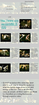
As a group we were all heavily influenced by metalcore promos by bands such as Architects, Bury Tomorrow and While She Sleeps. They are all incredibly talented bands and the videos feature very memorable performance and narrative footage.
Architects ‘Follow the Water’ features performance throughout the whole video in the promo and takes place in a live element. It highlights their ability and the energy of how they play a live gig. The promo shows the bands credibility and technique as when people view the video, they realise how good the band are, creating a larger fan base and a demand for tickets for a live show.
Another video that influenced us was Bury Tomorrow ‘Lionheart.’ We were really impressed by the range of performance shots in the video and the shaky camera effects which really emphasised the heaviness of the music.
 |
| Mid shot of the front man, in the centre of the frame, shows his dominace and importance to the band |
 |
| Mid shot of the drummer playing, shows his ability and technique. The shot also includes some of the cymbals |
 |
Shaky camera work matches the tempo and aggressiveness of the song whilst showing the bass player going crazy |
Lastly, While She Sleeps ‘Believe’ is another very influential metalcore video that we were impressed by and felt like incorporating certain elements into our video. The camera is constantly moving in the video and is also very up close and personal with the band members. Having close ups of band members focuses on their ability to play their instruments and their importance to the band. With the constant use of camera movement it keeps the promo interesting and energetic, a popular convention in metalcore promos. The quick cuts of the performance add to the power and energy of the band and song which is very effective.
- Here are some analysed screenshots of our music promo and While She Sleeps 'Beleive'
 |
| This shot is of Zak Pinchin, the frontman. The close up focuses on his importance in the band and shots of him feature most throughout the promo. The photo below is the frontman from While She Sleeps, again lots of close ups and extreme close ups feature in the promo, showing his importance |

 |
| This screenshot is a close up of Phil, the guitar player, it focuses on his technique and ability and also shows off his convetional clothing and tatoos of the metalcore genre. The mid shot below shows the guitarist and the some of the equipment behind as well as convetional metalcore clothing. |

 |
| The close ups of the singers show the importance to the band and their ability to sing. The camera is focused on the singers and so the background is out of focus, showing that the band member is the stand out image on the screen. |

 |
| The midshot of the drummers shows the drum kit as well as the majority of the drummer. Having some of the drum kit in the shot shoes the what the individuals role is in the band and also emphasises what they are playing. Also when syncing the track to the drum hits, it looks very proffesional |

 |
| Screenshot from Architects 'Buried at Sea' narrative |
When planning our narrative we wanted it to memorable whilst being bizarre and abstract; we researched many narratives from the metalcore genre and we found that they often didn’t make sense and also featured strange props and characters. We took inspiration from Architects ‘Buried at Sea’ as the narrative features a man waking up in a coffin on a beach, having no memory of where he is but finding a key that obviously unlocks something. He only has a certain amount of time to find what he has to unlock and when he doesn’t, he reawakens in the same coffin and again has to find where the key belongs. We found this to be very interesting and bizarre and based our narrative on the same idea of having to find something but not fully knowing what the object is. When our narrative begins the actor is blindfolded for an unknown reason and stumbles across the mirror; he rips the blindfold off but when he looks into the mirror, his reflection is still blindfolded and has a mind of its own. The reflection begins reading a book and looks to his right, showing that the actor must search for a book to solve this mysterious behaviour. The actor searches through a
 |
| We took inspiration from the artwork to include a blindfold in our narrative |
For the location of the narrative we used one of the group member’s office in his garage. We again had access to power which was needed for the use of the halogen lights and because it was our group member’s office it was easy to get to and didn’t cost money. The size of the office was manageable as it fitted the two main props in and provided space for the whole group to fit in with one member acting with the others filming and directing.
 |
Morton Village Hall where we filmed the performance |
 |
| We used two of these industrial lights and two floor lights to light our performance |
We chose to rent out Morton Village Hall for the performance side of filming as the band have often played live gigs there and we felt that there was enough floor space to set up the drum kit and band positions to capture footage without getting much of the wall design and radiators in the frame. We achieved this by putting stands in front of the radiators with industrial lights aiming down at the space where the band will perform. We also placed the speakers in front of the stands to show that the band are playing their instruments live, adding to the live performance element of the promo. Another reason we chose to rent out the hall was because of the easy access to electricity. We had two large halogen industrial lights at our disposal as well as three smaller ones we could use. For our thriller opening at AS Level, as a group we did not organise and plan the lighting for filming efficiently enough and therefore the footage we came out with was very dark and ultimately made our final piece poorer than it should have been. So for our music promo we made sure we had the resources to make the lighting work which leads to much better footage. The location is conventional to the metalcore genre with enough space for the band’s performance but there isn’t any notable design or significance to the décor as with many metalcore promos, the location tends to be dingy and run down, an old church or an abandoned factory for example. Old churches have connotations of death and decay as well as the obvious religious aspects which many metalcore bands address in their lyrics. However the location we used doesn’t have any notable features but the use of lighting for the video makes the performance stand out and memorable rather than a more extravagant location.
 |
| Feed the Rhino video has an unknown location with really effective lighting so the only thing that can be seen is the band and bright lights in the background. In our video, the location is quite plain but we made it look a lot more interesting with two halogen lights in the background and two floor lights lighting the band from the front. |

The band wore conventional clothing from the metalcore genre for the performance side of the music promo. The drummer, two guitarists and bassist wore skinny jeans with a white tee shirt whilst the frontman wore a burgundy tee shirt and skinny jeans. The idea of this was to have the frontman stand out from the other band members whilst the individuals behind him looked formidable and intimidating. Members of other metalcore bands wear skinny jeans and tee shirts and this is how In Archives as a band dress normally so we felt no need to change the dress code and break conventions.
 |
| Here the frontman stands out from the rest of the band with his red tee shirt on. The other four band members wore white band tee shirts or vests which is conventional to the metalcore genre. The lighting also captures the colours well on the white and black. |
When editing our video we wanted to make the promo fast paced and exciting for the audience. The song is fast paced and very heavy and we emphasised this with a lot of quick cuts and hand held camera footage. By making the cuts quick and short, it goes along with pace and beat of the song. The quick cuts would often be of one band member which cuts to another angle of them and then cuts to a different band member. To emphasise the heaviness of certain parts of the song we put footage of the frontman stomping or the guitarist swinging his instrument to the beat which is conventional to the genre. We also used a dolly for panning shots which slows down the performance in certain parts of the song. We filmed the band playing the song twice with the dolly going left to right and then twice forward and backwards to add movement to the camera. The whole band feature in these shots and the slow movement of the camera moving forwards or to the side is an efficient change in pace to the quick cuts.
When we researched music promos we found that the majority of them feature band performance as well as narrative. We wanted to continue this structure by filming a performance side and a narrative that would break up the performance. We found that with metalcore promos the performance side is more prominent than the narrative but the narrative still features a lot to break up the performance and keep the promo interesting and memorable. The main idea for our narrative was for it to be mysterious and abstract whilst not becoming a full story. We used Steve Archers music video theory when planning our music promo, he states that ‘there needs to be a strong and coherent relationship between narrative and performance in music promos.’ We wanted the performance side to be the more prominent part of the promo but when the narrative comes in we wanted it to be memorable as well with both parts complimenting each other. He also said that there may be an ‘extra aspect of the video designed to aid visualisation and the ‘repeatability’ factor.’ We felt that having an energetic performance and an abstract narrative that work together helps gain the repeatability factor.
 When designing our digipack we were heavily influenced by other metalcore digipacks. The layout of a metalcore digipack often features gatefolds that fold out to show the album CD as well as two other panels that could contain a bonus CD or a booklet containing lyrics to the songs. The design often features artwork that continues as a theme throughout the digipack, bleeding into each panel to show that it is all the same. The colours of a metalcore digipack are conventionally quite dark, with a lot of black and grey being used, to follow on with dark connotations of the bands lyrics for example. One that we took inspiration from was Architects album cover ‘Hollow Crown.’ We wanted our digipack to be simple but also contain something that was eye catching and different to other digipacks. From the ‘Hollow Crown’ digipack the cover features the Architects ‘A’ logo. We felt that this simple design in fact made the digipack better as it didn’t try to be anything special and the logo clearly showed who it was by. This influenced the band to design a new logo which was then put on the cover of the digipack.
  |
| We were influenced by Enter Shikari's digipack as this contiued theme throughout the digipack looks really effective and eyecatching whilst making the three panels appear as one. |
We added certain effects to it to make the digipack look old and dirty as well as having a continued theme of live shots on the inside covers which we were influenced by Enter Shikari’s digipack ‘A Flash Flood of Cover.’ Inside their digipack, the gatefold contains one photo of an open field but with Enter Shikari’s triangle symbol in the background. We wanted a theme that continued throughout the digipack so having five live shots of each band member on the gatefold added continuity as well as originality. Having the live shots in the gatefolds almost makes the fold outs seem one, adding to the visual element of the digipack We also added the dirt effect to the edges of the inside gatefold which again carried on the theme throughout the whole digipack. As well as having the dirt element to the edges of the cover and foldouts, we also added an old fashioned wallpaper pattern to the background of the foldouts. This also continues as a theme throughout the digipack, with connotations of the ruined and decaying, which links to the metalcore genre. The wallpaper pattern links to the videos narrative as the mirror’s frame features a very significant pattern. Having this on our digipack links the music promo together, showing that it all has meaning and significance. The dirt on the digipack also has meaning, with archives meaning a collection of historical records; we wanted to link this with the bands name with old records that are stored in archives are often worn and ruined with age. Therefore the dirt on the digipack is reference to what the condition of the documents would be in, showing that the digipack could be an old document that has come out of an archive.
 For our magazine advert we found that the main conventions were to showcase the band with a promotional photograph as the main feature on the page. Alongside the photo, the digipack album cover is present, showing fans the artwork of the digipack that will be available in stores. Text is also present with information about the release date as well as ratings given by magazines that are consistent with the genre. Some magazine adverts feature logos of where the album can be digitally downloaded as well as websites were it can be bought online from website such as iTunes, play.com and amazon.co.uk.
No comments:
Post a Comment